
12 Outdated Web Design Trends to Avoid in 2025 & What to Do Instead
Prefer to watch?
Here’s the video!
Mentioned in the Video:
*Yup - that’s an affiliate link! My margarita fund thanks you kindly!
Rather read all about it?
Is your website stuck in 2024—or maybe even 2020?
If you’re still relying on trends that are past their prime, you could be unintentionally giving visitors the wrong impression and costing your business dearly.
Keeping your website fresh and modern is more than just aesthetics—it’s about creating an engaging experience that aligns with your brand and resonates with your audience.
In this post, I’m breaking down outdated web design trends that need to go and showing you what pro designers are doing to keep their sites aligned with the future of design.
So, if you’re ready to bring your site up to date and stay ahead of the design game, let’s dive into the trends.
Trend #1: Light, White & Airy → Bold Color

The light and airy aesthetic had its moment—it was everywhere, and for good reason.
This trend fit beautifully in the wedding industry, where soft palettes and airy visuals naturally suit the vibe.
But somewhere along the way, this look expanded into businesses like financial planners, content creators, and influencers.
While light and airy might still work for wedding professionals, outside of that niche, it’s starting to make websites look a bit dated.
If you’re noticing this aesthetic on your site, it might be time for a refresh.
How to Update This Trend:
Add Bold Colors: Take inspiration from Viral Cuts, which uses rich and vibrant hues throughout their website. 👉
Mix Your Palette: On my recent website redesign, I transitioned from a light and airy vibe to a much bolder approach.
Think colorful backgrounds, pops of contrast, and a mix of vibrant tones that feel fresh and modern.
Moving away from overly soft designs and embracing color can make your site feel current and engaging, especially if your business isn’t in the wedding industry.

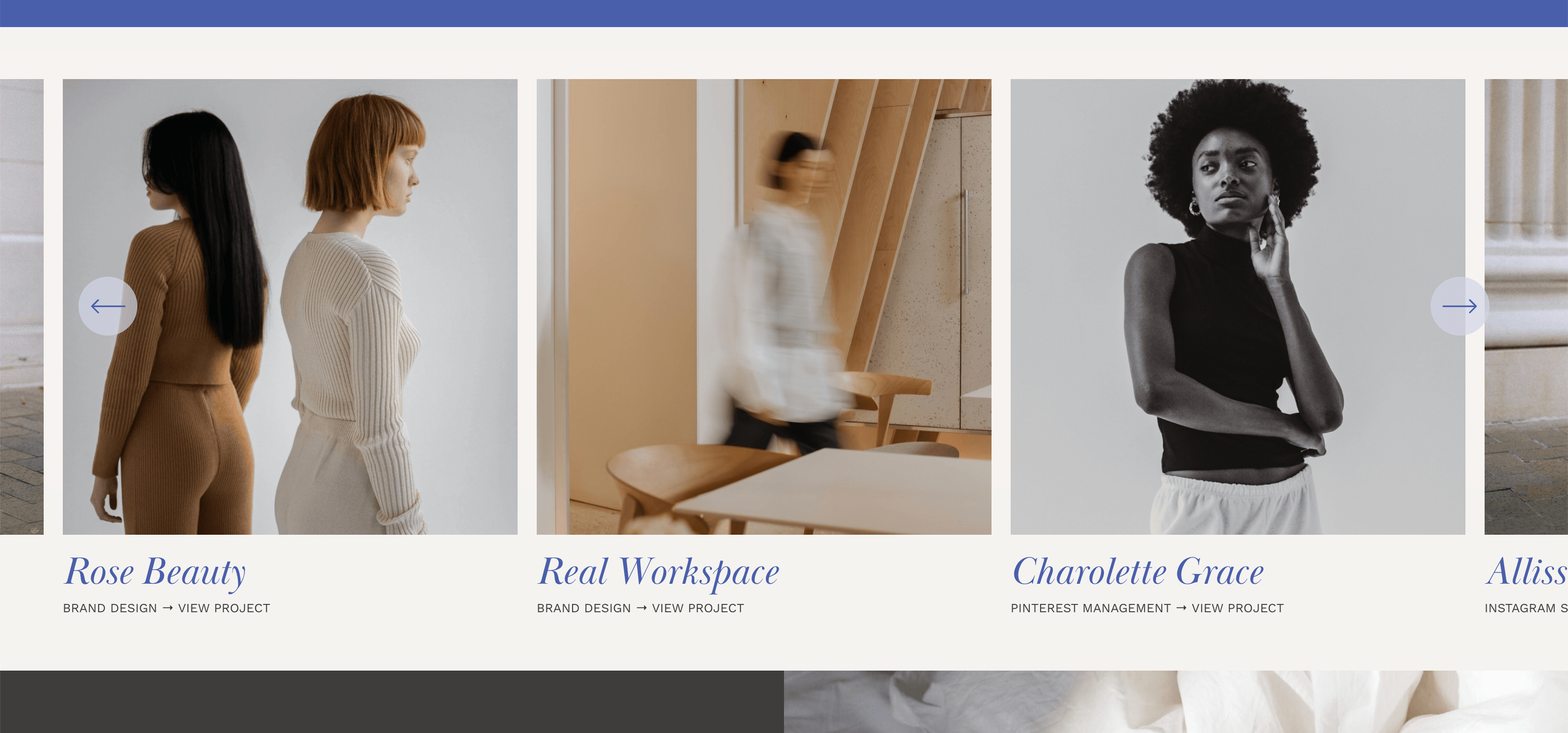
Trend #2: Short Sections → Mega-Tall Sections
Gone are the days of ultra-short website sections that fit neatly on a single screen without any scrolling.
While this might have seemed clean and efficient in the past, it now feels outdated and static. Websites today thrive on storytelling and flow, and that often means embracing longer, scrollable sections.
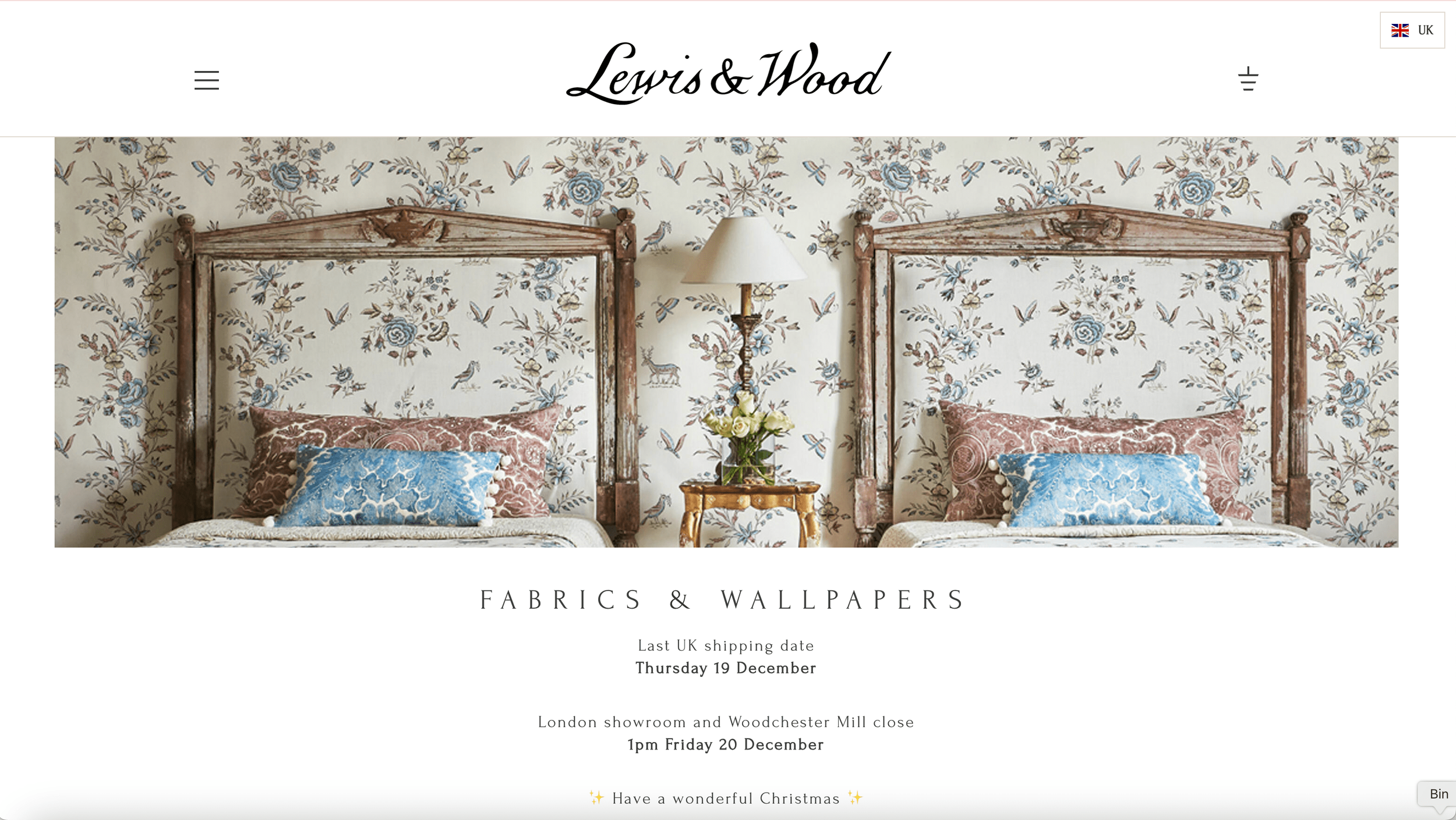
Examples of Outdated Short Sections:
Lewis & Wood, a fabric company that I genuinely love, has a homepage featuring sections where you can see the entire image and all content without scrolling—a design choice that now looks dated.
Tim Ferriss(as much as I adore him) also has a website with overly short sections.
How to Modernize This Trend:

Create Mega-Tall Sections:
Check out this website by Freya Rose Tanner. 👉
Her long, scrollable sections feel fresh and allow the content to breathe.
Use Tall Template Designs:
The Go Live HQ Trove template is a great example of how to do this.
The sections require scrolling to fully view the content, which is not only okay but looks incredibly modern.
By giving your sections more height, you’re inviting users to scroll, engage, and immerse themselves in your content.
Remember, scrolling is second nature to most users—it’s no longer something to avoid.
Trend #3: Static Shapes → Interestingly Cut Images
Gone are the days when every image had to be a perfect square or rectangle. While traditional shapes can still work if done well, incorporating more creative image crops can instantly make your site feel modern and engaging.
Interesting shapes add a sense of personality and uniqueness, setting your design apart.
How to Modernize This Trend:
Use Creative Cropping:
Check out my own headshot (below on the right) where the top of the image has been cut into an interesting, modern shape.
On my student success stories page (example below on left), I’ve used tall oval-shaped image crops for the student portraits, which gives them a fresh, elegant look.
Play with Arches: The Trove Agency website template (below center) is another great example. The images feature arched tops, adding a subtle but modern twist.


Key Takeaway:
You don’t have to use specific shapes like arches or ovals—get creative! Any shape beyond the standard square or rectangle will give your website a current, polished look.
Trend #4: Static Designs → Subtle Movement
Previously, websites were entirely static—you’d scroll through a page, and everything remained perfectly still.
Today’s modern websites often include small, dynamic touches that add subtle movement to the design. The keyword here is subtle—we’re not talking about distracting animations or overwhelming effects but small shifts that bring the site to life without disrupting usability.
Examples of Subtle Movement:


Scroll-Based Movement:
On this website template, as you scroll, a squiggly line behind the text moves ever so slightly, adding dimension and depth.
A Pinterest management image also shifts gently while scrolling, creating a sense of fluidity.
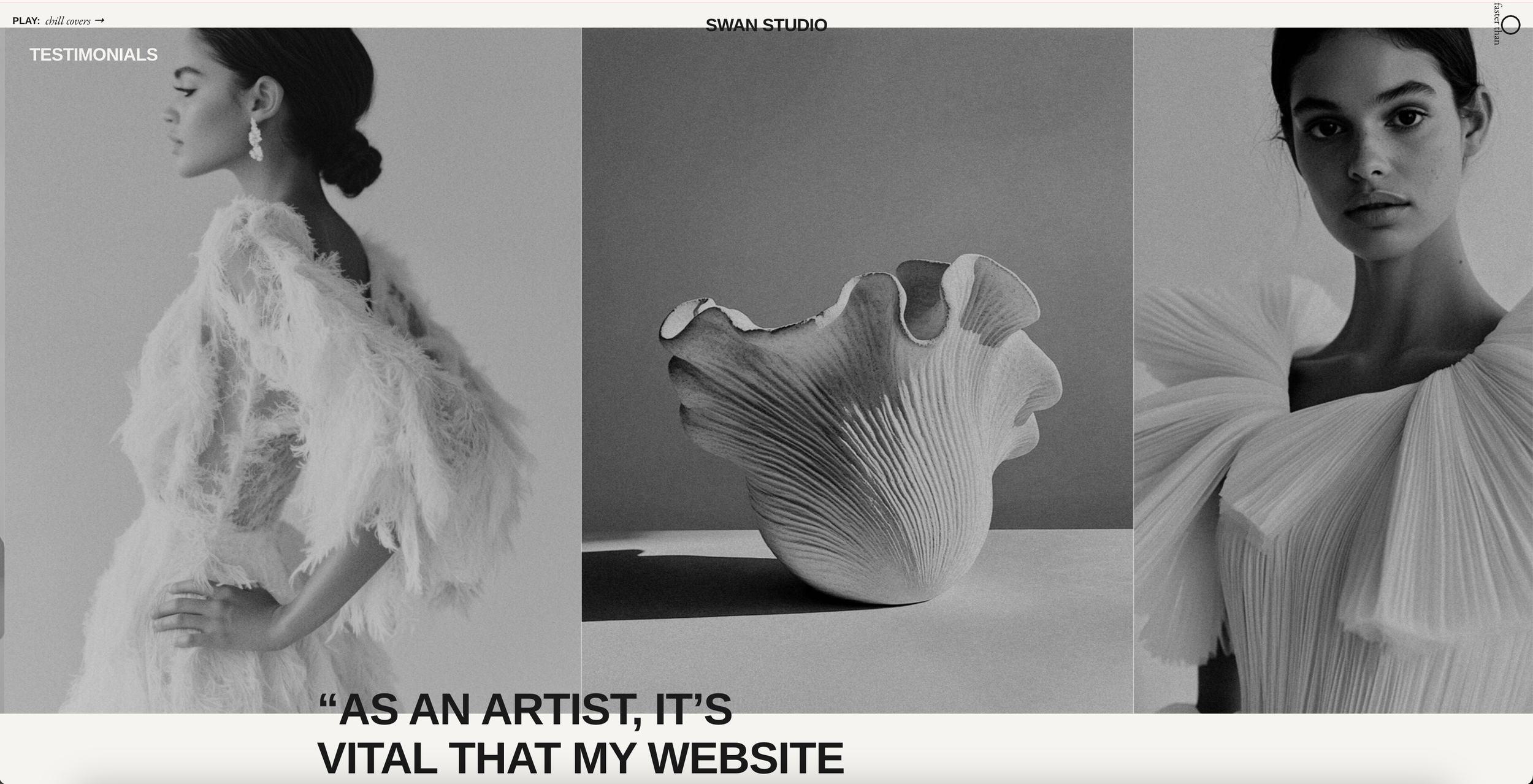
Ongoing Movement:
The Swan Studio website features images on the right-hand side that are constantly and subtly shifting, even when the user isn’t scrolling. 👉
In the center of the page, the text dynamically changes (e.g., "We are creators. We are artists. We are designers."), while the accompanying image has a slight shake and shift effect.
Shapes Falling into Place:
On the Atom’s App website, shapes on the right side fall into place as the page loads, offering a small but eye-catching detail.
Promoted Freebies Section:
On my own site, the freebies page incorporates movement, with images subtly shifting as users scroll. 👇

Why Subtle Movement Works:
These small touches create an engaging user experience that feels modern without being overwhelming. They bring life to the page and subtly guide visitors’ attention without detracting from the content.
Trend #5: Boring Blocks of Text → Sideways Sliders
This is a trend I’m honestly a bit conflicted about.
Disclaimer: While sideways sliders look incredible and feel modern, they’re not always the most user-friendly option. Before jumping into this trend, think carefully about your audience and whether it’s the best choice for your site.

What Are Sideways Sliders?
Sideways sliders allow content to open like a folder sliding in from the left or right when clicked.

Example 1: On Lydia Elise Millen’s website, clicking on an element makes additional content slide open horizontally.
Example 2: On the Addison Shock Coaching website, you can click left or right to reveal content sections in a similar style.
Example 3: Ashlyn Writes also incorporates this trend, creating a folder-like effect for opening content.
My Thoughts on This Trend:
Pros: Sideways sliders look sleek and innovative, giving your website a polished, professional feel.
Cons: They can complicate usability, especially for older audiences or those less tech-savvy.
Reminder:
Design decisions should be driven by strategy, not just trends.
Consider your ideal client and their preferences before implementing something like this. If usability might take a hit, it’s better to opt for simpler solutions.
Psst…if you’re feeling inspired to refresh your website with strategic and functional updates, check out my Start Your Squarespace Website Workbook. It’s a free resource to help you build a website that balances beauty and usability.
Trend #6: On-Page Layouts → Running Off the Sides of the Page
Content no longer needs to stay boxed neatly within the traditional webpage boundaries.
Today’s modern designs often have elements that run off the edges of the screen, creating a sense of flow and movement.
Examples:
Swan Studio Website: Swan Studio does a beautiful job with this trend. Here, images and text slide in naturally from one side of the page to the other, creating a seamless and engaging experience. 👇
Unearth Template by Big Cat Creative: On this template website, sliders bring in content from off the edge of the screen. 👉
The design feels dynamic and visually interesting.
Why It Works:
Content running off the sides of the page gives a sense of fluidity and modernity to your site. It’s an excellent choice for sites looking to break free from rigid layouts while maintaining a clean, professional feel.
Trend #7: Static Content → Fading Elements
Fades have become a popular design element for websites, where content appears or disappears as you scroll.
This subtle animation creates a sleek, modern look while guiding the user’s attention down the page.
Examples of Fading Designs:
PaigeBrunton.com:
On my website redesign, I incorporated this trend using a tool called SquareKicker.
As you scroll, the content and text fade in behind images, creating an elegant effect.
Swan Studio Website:
On Swan Studio’s website, the content fades into view as you scroll, adding a touch of sophistication to the design.
How to Use Fades on Your Site:
Use tools like SquareKicker for Squarespace to integrate fading elements seamlessly.
Apply fades to text, images, or sections to add subtle movement and visual interest without overwhelming the user.
Why Fades Are Effective:
This trend brings life to your website in a way that feels both modern and effortless.
It’s an excellent way to guide your user’s focus as they scroll through your content.
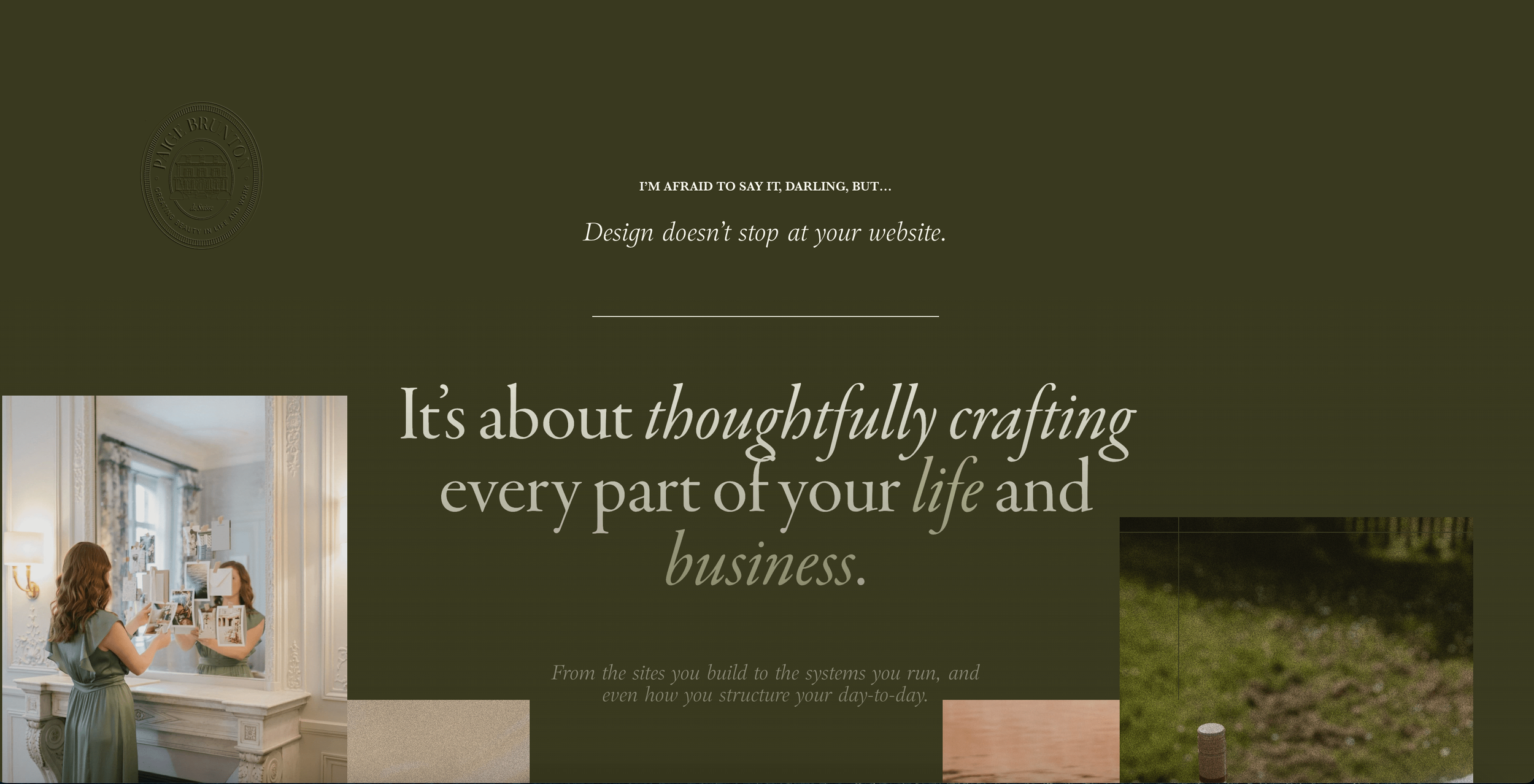
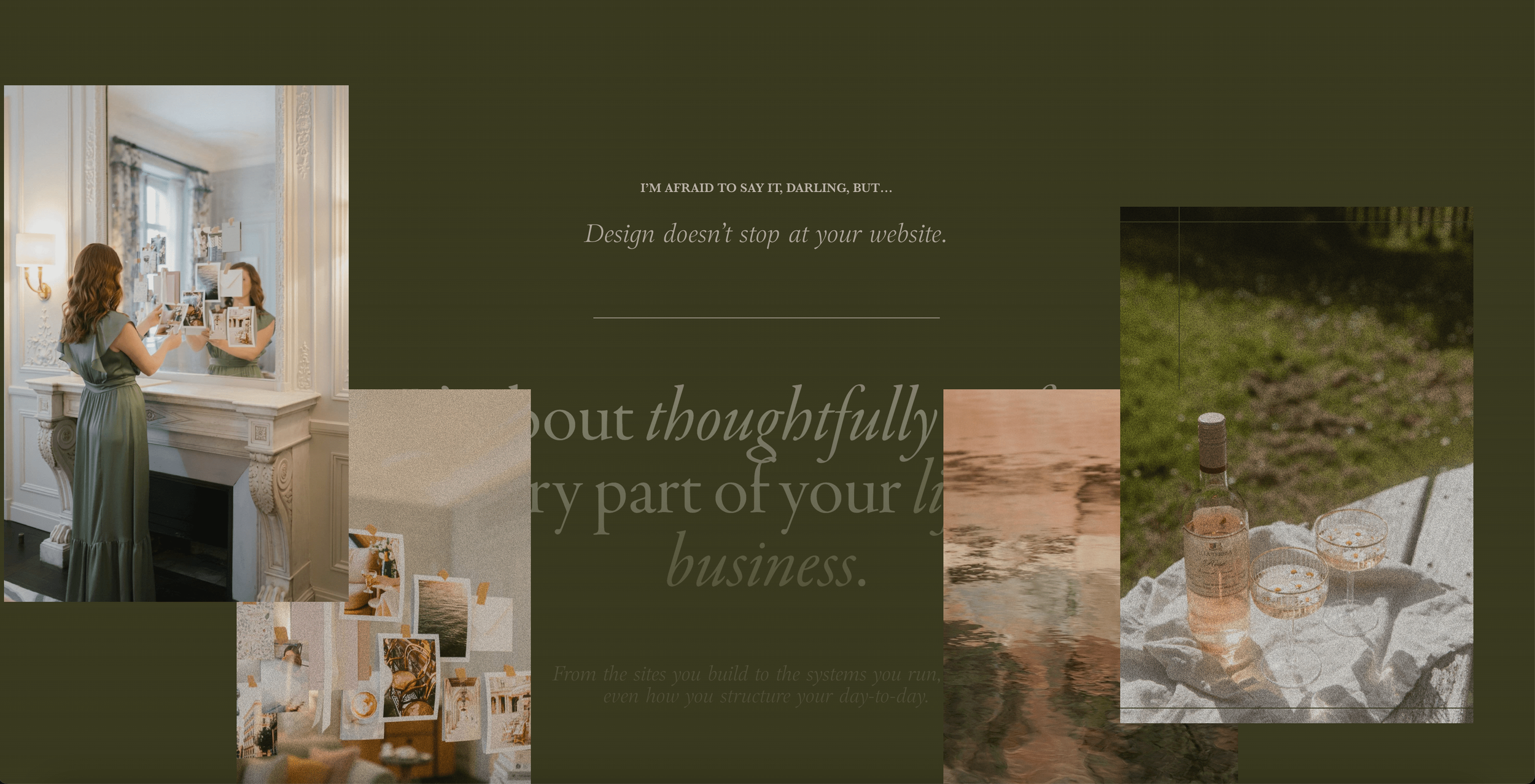
Trend #8: Flat Designs → Texture in Design Elements
Texture is no longer reserved for real-world objects like wood, fabric, or paper.
It’s making a comeback in web design, adding depth and visual interest to otherwise flat, digital spaces.
By incorporating textures, you can give your website a tactile, almost physical feel that feels more natural and engaging.
Examples of Texture in Web Design:
Textured Paper Effect: On my website redesign, I used a background that mimics textured paper, adding an embossed effect created in Photoshop to enhance the look. It’s a subtle yet striking way to elevate the page design (see right hand image below).
Creative Wash Up Website: On this website (see left side image below) the beige background isn’t just a flat color—it has the appearance of canvas, adding a layer of depth to the design.
Embossed Crest: On another section of my site, I used the same embossing technique to imprint my crest into a green background, creating a polished and tactile feel (see center image below).


Why Texture Works:
Adding texture makes a website feel more tangible and immersive, creating a visual experience that mimics real-world materials.
It’s perfect for adding sophistication and interest without overwhelming your design.
Trend #9: Uniform Fonts → Font Style Mixing
Gone are the days when a headline or line of text was written in one uniform font style.
The new trend?
Mixing font styles within a single piece of text to create visual interest and highlight key elements!
Examples of Font Style Mixing:
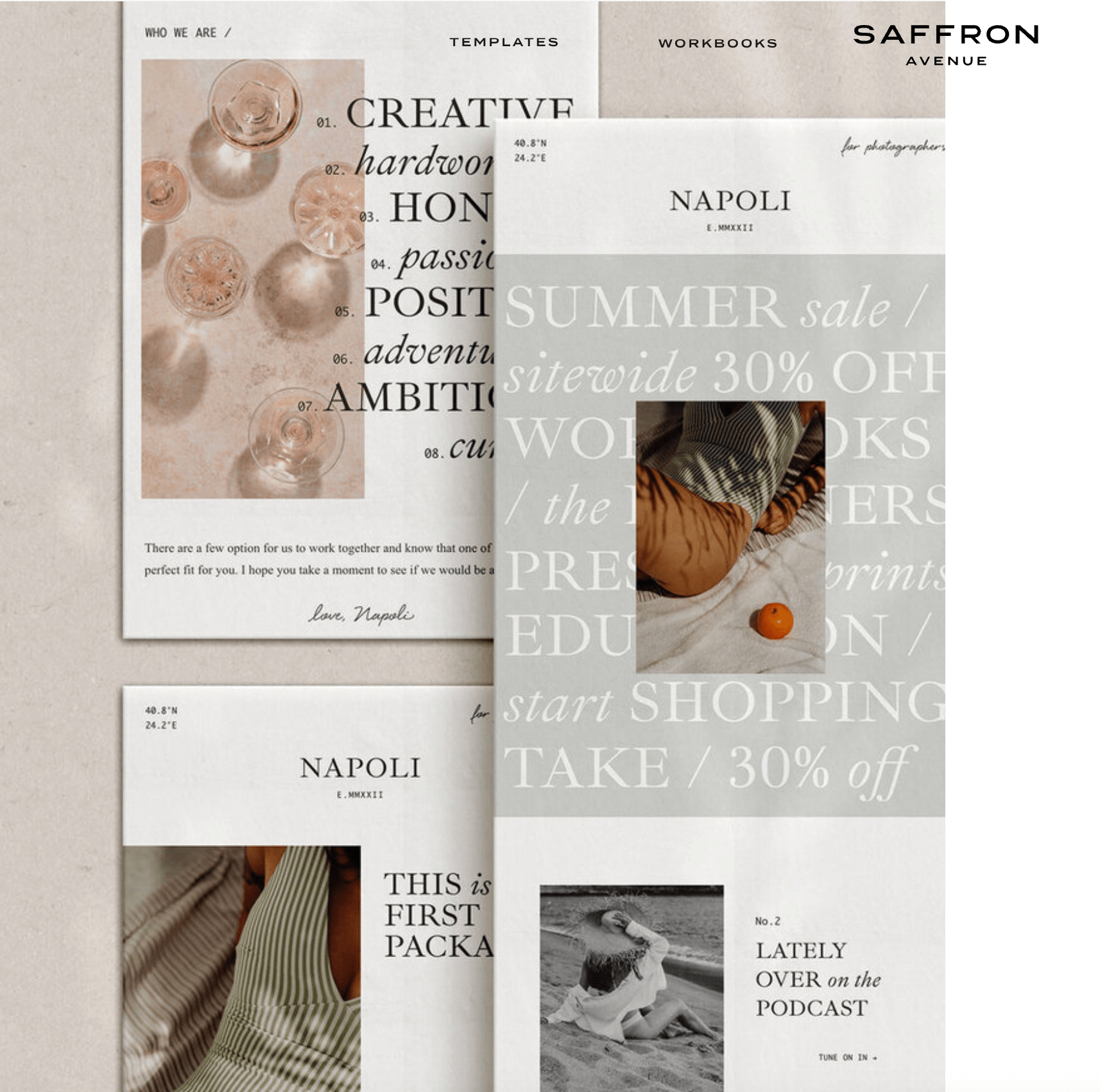
Email Templates from Saffron Avenue: On this email template example, the word "Summer" is all capitalized with no italics, while "Sale" is lowercase and italicized.
This mix of styles grabs attention and feels dynamic:
2. PaigeBrunton.com: On my own website, I used font style mixing to promote three types of gifts: business-building gifts, Squarespace gifts, and email list-building gifts.
Each type uses a slightly different font style to create contrast while keeping the overall look cohesive:

How to Use This Trend:
Font style mixing works best for short headlines, promotions, or highlighted text. Play with capitalization, italics, and weights to create emphasis while maintaining readability.

Trend #10: Regular-Sized Text → Mega Fonts


Mega fonts continue to trend in 2024 and are a fantastic way to make a bold statement.
These oversized text elements grab attention and work especially well for short, impactful pieces of text like headlines, names, or promotions.
Examples of Mega Fonts:
Jasmine Star’s Website: On Jasmine Star’s website, her name and headings are styled in oversized fonts, creating a striking first impression (see upper right side image).
Note she is also using trend #9 Font Style Mixing!
Jenna Kutcher’s Website: On Jenna’s site, massive text is used in the background behind her as well as in the freebies section later down the page. Note, Jenna does a fabulous job in using this trend for short pieces of text only.
The Atomic Habits Website is yet another example of a creative way to use the mega text trend (see left hand image above).
Pro Tip:
Mega fonts work best for short pieces of text. Avoid using them for long paragraphs, as they can quickly become overwhelming and hard to read.
Outdated Trend #11: Squish (Tight Layouts) → Space to Breathe
In older website designs, layouts often felt crowded, with little room for the content to breathe.
Today’s modern websites embrace space, prioritising simplicity and readability by spreading out content and creating clean, open designs.
Examples of Squish vs. Space
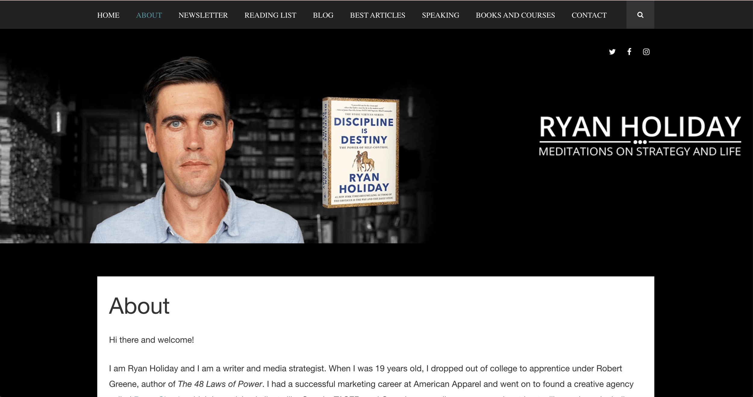
Ryan Holiday’s Website: On Ryan Holiday’s site, the content feels a bit crowded and compressed, with too much happening in a small section.
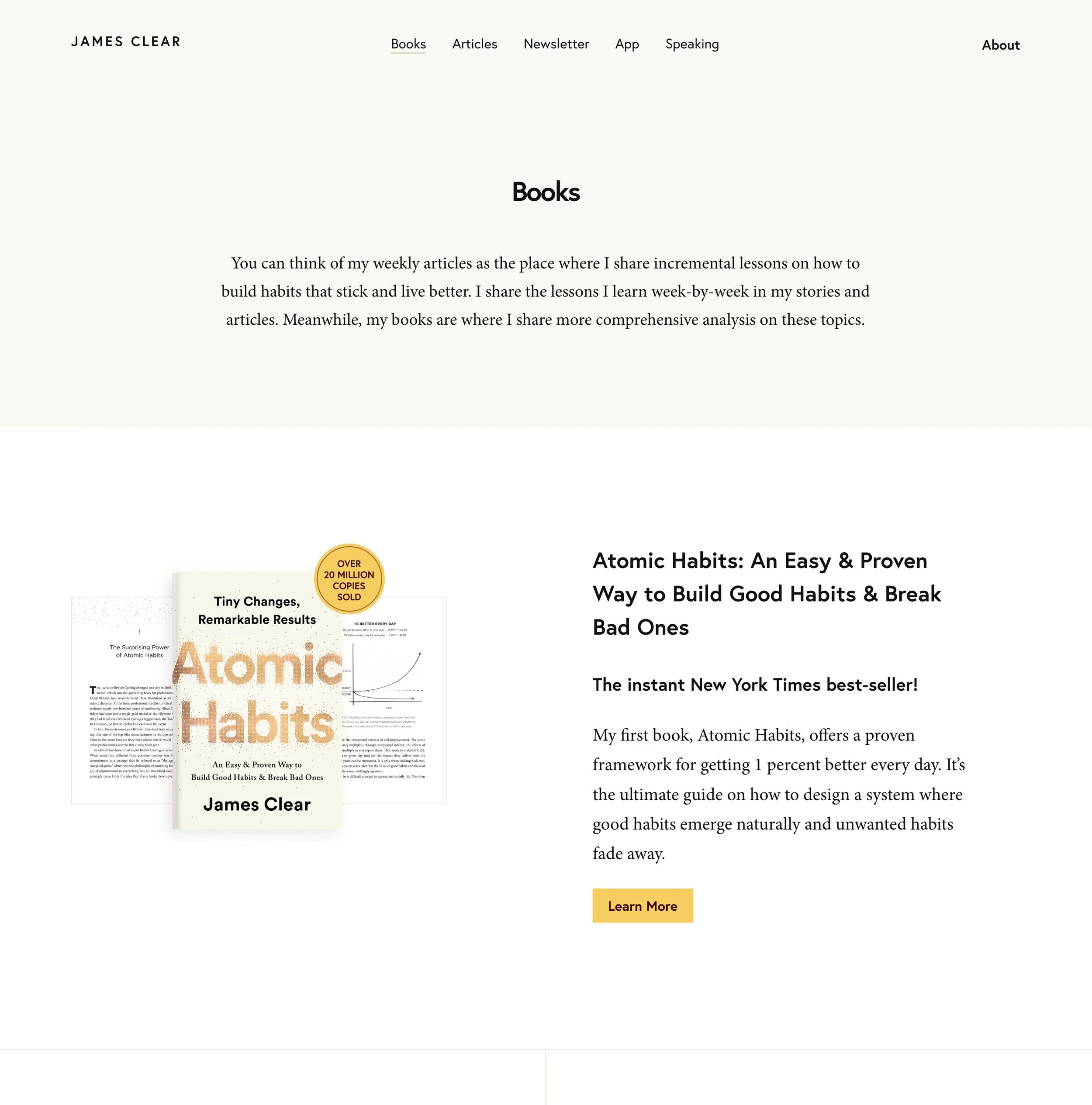
James Clear’s Atomic Habits Website: By contrast, James Clear’s site feels simple, open and spacious. While it contains a lot of text, the clean layout and generous use of space make it easy to navigate and read.
Why Space Matters:
Adding space makes your website feel modern, clean, and professional. It enhances readability and ensures visitors can focus on what matters most without feeling overwhelmed.
Trend #12: White Backgrounds → Anything But White
White backgrounds with some photos and text layered on top were once the gold standard in web design—they were clean, simple, and easy to execute.
What we are seeing now is literally anything but that.
Modern design has moved away from plain white sections, replacing them with anything but white.
Neutral tones, rich colors, and images are being used as backgrounds to add depth and visual interest, and the result is stunning.
How This Trend Looks in Action:
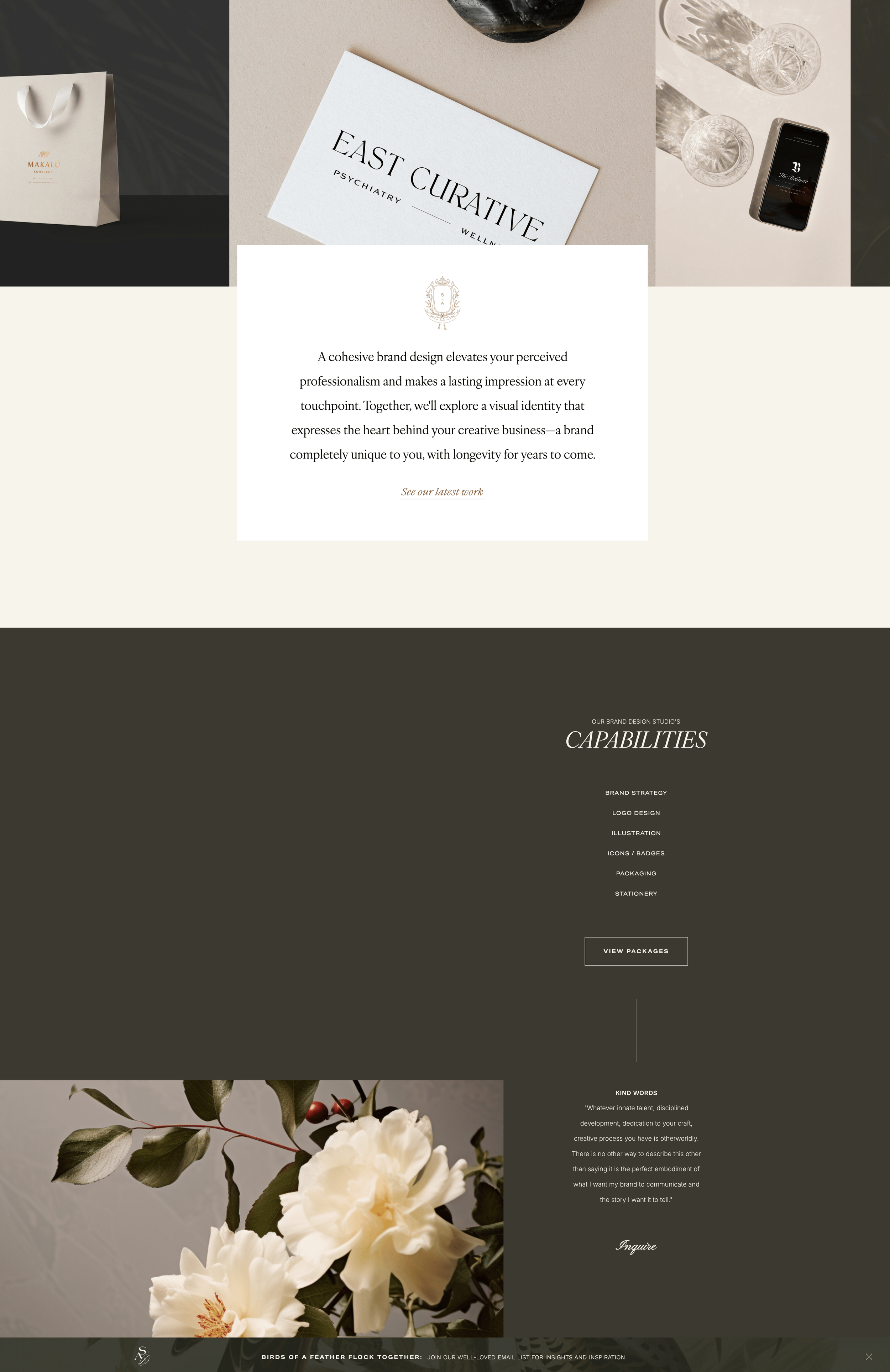
On Sarah Ann Design’s website, you’ll notice a mix of backgrounds as you scroll—beige, gray, green, and even textured images.
There’s almost no white to be found, except for small card-like elements layered over the backgrounds.
My latest website redesign also embraces this trend fully. The page alternates between bold colors and images, with just the occasional light beige for contrast.
Pro Tip:
If you’re new to website design, this trend can be a bit harder to pull off.
Start small by experimenting with neutral tones like beige or soft gray instead of jumping straight into bold colors or complex image backgrounds.
It’s an easy way to ease into this trend without overwhelming your design.
Ready to Build a Website That Converts?
While staying on top of web design trends is important for keeping your site looking fresh, the real key to success is strategy.
A truly effective website isn’t just beautiful—it’s purposeful, polished, and designed to connect with your audience.
If you’re ready to take your website to the next level, my Start Your Squarespace Website Workbook is here to help.
WHAT’S INCLUDED:
Setting up navigation that guides visitors seamlessly.
Choosing the right template for your goals.
Clarifying your website’s purpose and direction.
And so much more!
You’ll get step-by-step guidance to create a site you’re proud of—one that looks amazing and works hard for your business. Download your copy here, and best of all, it’s on the house.
Also, struggling to pick the perfect color palette for your website?
I know how tricky it can be, but choosing the right colors makes all the difference in creating the perfect look and feel.
Watch my video on choosing a professional color palette next and learn how to create a stunning design like the pros!