
Step-by-Step Website Redesign: From Outdated to High-Converting
Prefer to watch?
Here’s the video!
Mentioned in the Video:
*Yup - that’s an affiliate link! My margarita fund thanks you kindly!
Rather read all about it?
Most people know their website needs a redesign but feel completely stuck on where to start.
What do you fix first?
The design?
The copy?
The structure?
It’s overwhelming—until you have a plan.
The reason most websites look ‘off’ isn’t because you’re bad at design. It’s because no one teaches you the right process to follow step by step. But that’s exactly what I’m going to show you today.
By the end of this blog, you’ll have the exact framework to confidently redesign your website from start to finish. No more guessing, no more frustration—just a clear, repeatable process you can follow.
This isn’t just a quick tip video—it’s a full step-by-step process. I’m giving you the exact method I use to create websites that are not just beautiful, but strategic and high-converting. So whether you’re starting fresh or fixing what’s not working, this will help you get it right.
Here’s what we’ll cover:
Gather Visual Inspiration: we’ll start by gathering Visual Inspiration, so we have a strong design direction.
Map Out the Sitemap: next, I’ll map out the Sitemap, so we know exactly which pages we need.
Write the Copy: then, I’ll write the Copy—showing you my tools & approach for crafting messaging that works.
Gather Photos: after that, I’ll gather photos that fit the aesthetic and elevate the design.
Bring It to Life: And finally, the most exciting part—watch over my shoulder as I bring it all to life in a live redesign!
Step 1: Gathering Visual Inspiration
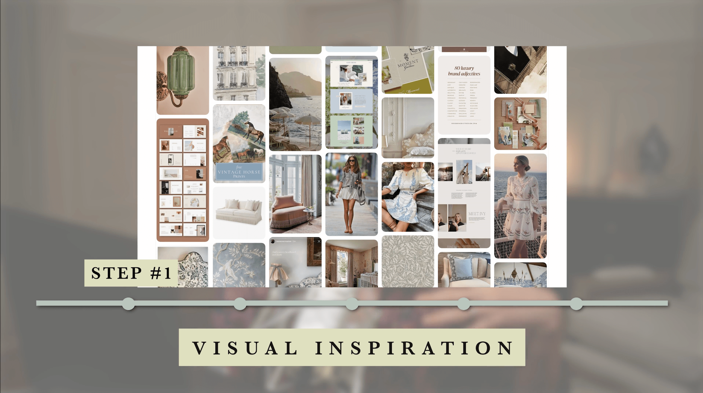
Before I start designing anything, I always begin by gathering visual inspiration.
Why This Step Matters:
This is where I define the overall vibe, aesthetic, and feeling I want my website to convey. Without this, it’s easy to end up with something that looks nice but doesn’t actually feel aligned with your brand or your ideal client.
Speaking of ideal client... this is a website redesign, I know my ideal client like the back of my hand, as well as the goal of my website and the must-haves on said site.
If you're not clear on those things however, grab my Start Your Website Workbook here!

It'll help you get clear on ideal client, site goals, site must-haves, etc. which will be kind of essential for you to know, before you even get into gathering visual inspiration.
Because it'll be hard to gather visual inspo if you're not clear on who this site needs to appeal to, (AKA, your ideal client.)
Brand Vibe Inspiration

The first thing I do is build out a ‘brand vibe’ inspiration board.
This isn’t about pinning website layouts—it’s about capturing the overall feeling I want my brand to embody.
I find images that reflect:
The colors I love
The lifestyle of my ideal client
The emotions I want the website to evoke
This helps me step into the mindset of my audience and ensure my website speaks to them visually.
How to Gather & Organize Your Inspiration:
Colors—What tones naturally reflect your brand’s energy?

Textures & Patterns—Do you want it to feel soft & elegant? Bold & modern?
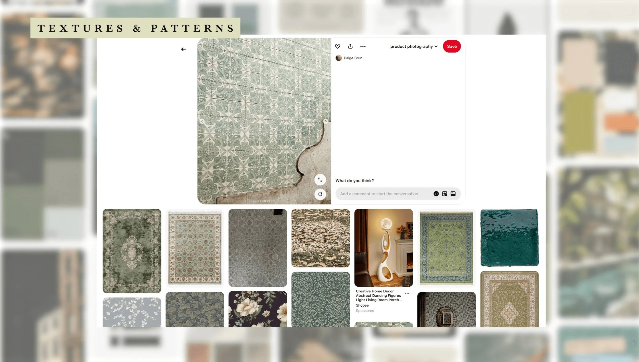
Lifestyle Images—Who is your ideal client? What do they wear, drink, and do?
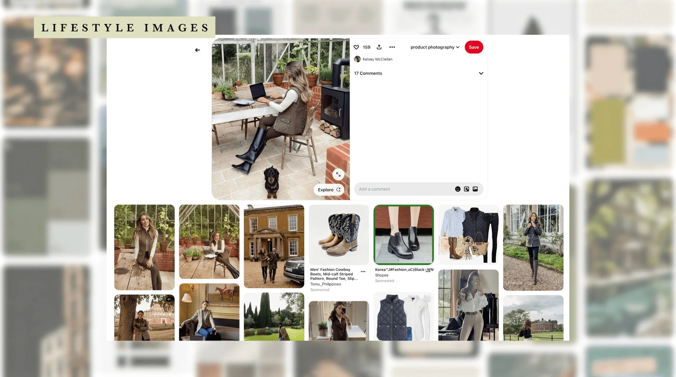
Typography Style—Is your brand playful? Sleek? High-end?
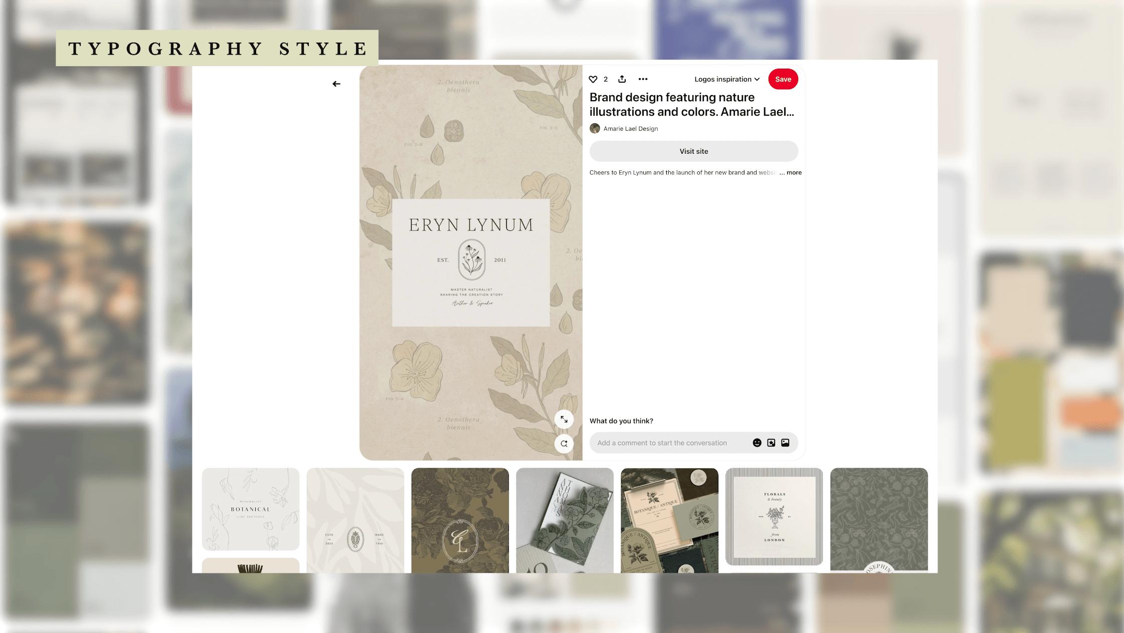
❗️Common Mistake to Avoid: Saving everything that looks ‘pretty’ but not actually thinking about whether it fits the brand. ❗️
Instead, step back and ask: Does this feel like my brand?
Wild Pinning & Editing Method for Colors:
If you’re unsure about your colors or ideal client vibe images or anything else, don’t overthink it at first.
Start by pinning freely—anything that catches your eye.
Step back and ask: ‘Does anything feel out of place?’
Remove what doesn’t fit will naturally refine your visual direction.
By editing it down, you’ll naturally create a cohesive color palette or brand vibe board without feeling boxed into decisions too early.
Website Section Inspiration
Once I have my brand vibe locked in, I move on to gathering specific website inspiration.
Instead of saving full websites, I focus on individual sections and elements I love—like navigation menus, hero sections, typography choices, and layouts.
This way, I can pull together elements that feel cohesive but aren’t just copied from one site.
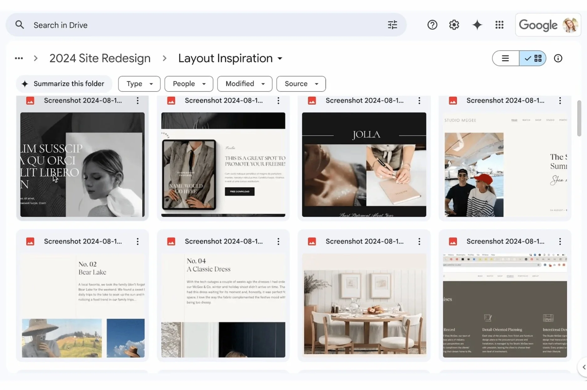
I do this by taking screenshots of only the bits I love (Command + Shift + 4 on a Mac) and saving them into a dedicated Google Drive folder. This makes it easy to reference later when I'm actually designing.
To find the best examples, I primarily look at other designers' portfolios and template shops. These places showcase highly polished, strategic layouts in one place, making it easier to spot strong designs.
So if you don't already follow a number of designers or template shops, now could be a good time to start being conscious of design work out there and following the designers whose style speaks to you.
Practice time:
Now it’s your turn!
Step 1: Spend 10 minutes pinning:
✔️ 10 images that represent your brand’s color & mood
✔️ 10 images that reflect your ideal client’s lifestyle
✔️ 10 website sections you love.
Step 2: Review them and edit it down.
Does anything, once you see it all together feel like it doesn't fit with the rest? Delete it from the board.
How to Use Your Inspiration Board Effectively:
Gathering inspiration is great—but only if you actually use it.
Here’s how to make sure your inspiration board doesn’t just sit there forgotten:
Keep it open on another screen while working on your website.
When choosing colors, fonts, or images, ask yourself: ‘Does this align with my vision and board?’
Use it as a reference check before finalizing any design decisions to make sure everything stays cohesive.

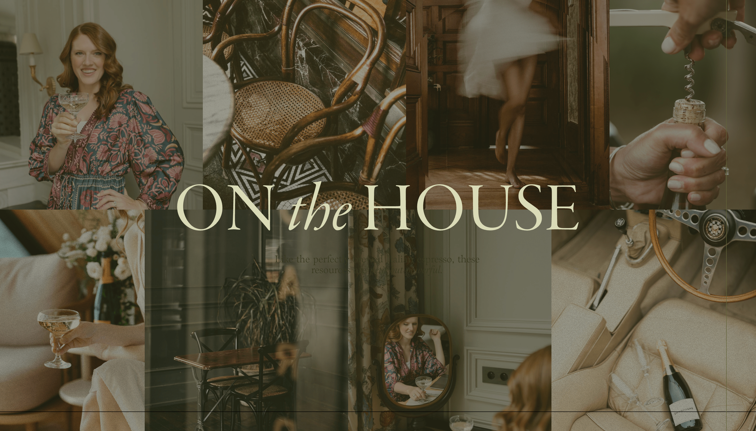
Final Mood Board & Why It’s Important:
Once I have both my brand vibe and website sections, I organize them into a clear mood board. This becomes my North Star for the redesign—helping me make confident design decisions without second-guessing every choice.
This step might seem simple, but this is what makes the difference between an okay website and a stunning one.
Here’s proof—
look at my original mood board & how those exact elements influenced my final design.

Now that we know how we want the site to look and feel, the next step is figuring out what content belongs where. This ensures the design doesn’t just look great—it functions well, too. Let’s move on to Step 2!
Step 2: Creating the Sitemap
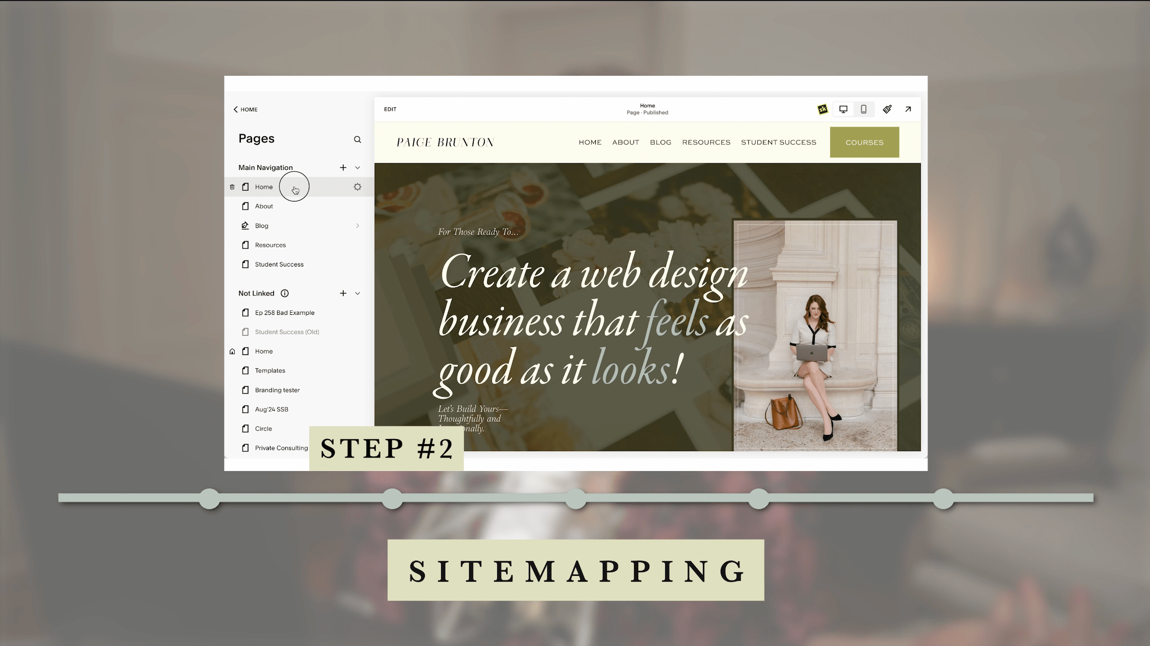
Now that we have a strong visual direction, it’s time to move on to one of the most important planning steps—creating the sitemap.
Why This Step Matters:
Your sitemap is the foundation of your website’s structure. Without a clear sitemap, you risk having a confusing site layout, missing key pages, or making it hard for visitors to navigate."
What is a Sitemap?
Think of your sitemap like a roadmap for your website.
It outlines:
What pages will exist
How they connect,
What their purpose is.
This keeps everything organized, intentional, and user-friendly.
First you need to decide what pages make it into your top navigation.
Not every page is important enough to get that prime spot.
How do you pick?
Here's my advice…
(straight out of my Start Your Website Workbook, which again, you can get here if you fancy!)
So sticking to the best practices of the workbook:
Minimize Navigation Items
There is a growing movement towards minimizing the top navigation options, and this is a good thing (you should do it too)!
Nine navigation items and drop down menus are way too many decisions to be made, all right up at the top of your website, let alone all the options on the home page itself.
Minimize the decisions.
Keep the links to your navigation to less than 6.
2. Take Home out of your navigation
You can take your ‘home’ page out of your navigation. Everyone knows to click on your logo to get back to the home page, so it’s just clutter really.
How To Pick Your Top 5
How do you decide what gets the prime real estate in your navigation?
It’s based on your website goals of course!
If you think you need to cut my navigation down, go through your list of must-have pages and ask the question:
'Which of these are essential for visitors to see upfront?'
Still unsure?
Here’s how I narrowed it down. Let me walk you through exactly how I structured mine and picked my 5.
Main Navigation:
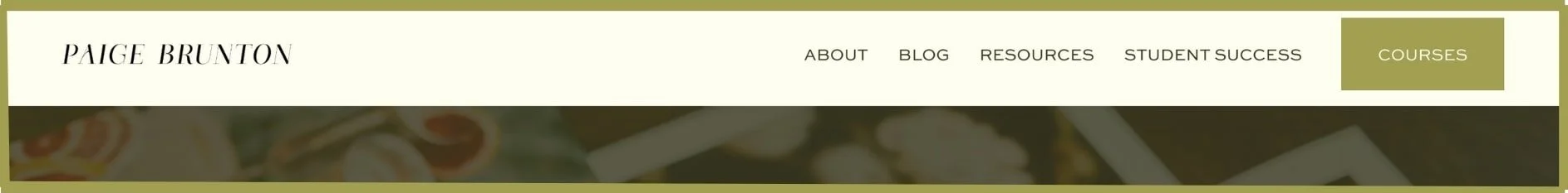
About
Because this website is very clearly a personal brand, I'm using the word "I" a lot and there's a ton of photos of me, naturally visitors are then curious to learn about me.
If you're a corporate brand, this might not be as important and your about page would likely go in the footer.
Blog
Because this is one of my main marketing strategies & I have hundreds of free blog posts, it's a huge crediblity & trust builder.
If your blog has a grand total of 5 posts or you hardly ever publish, you defintiely won't want this in your top navigation
Resources
Because I know that the #1 goal of my website is to get people onto my email list, and this page gives them 12,000 opportunities to do so.
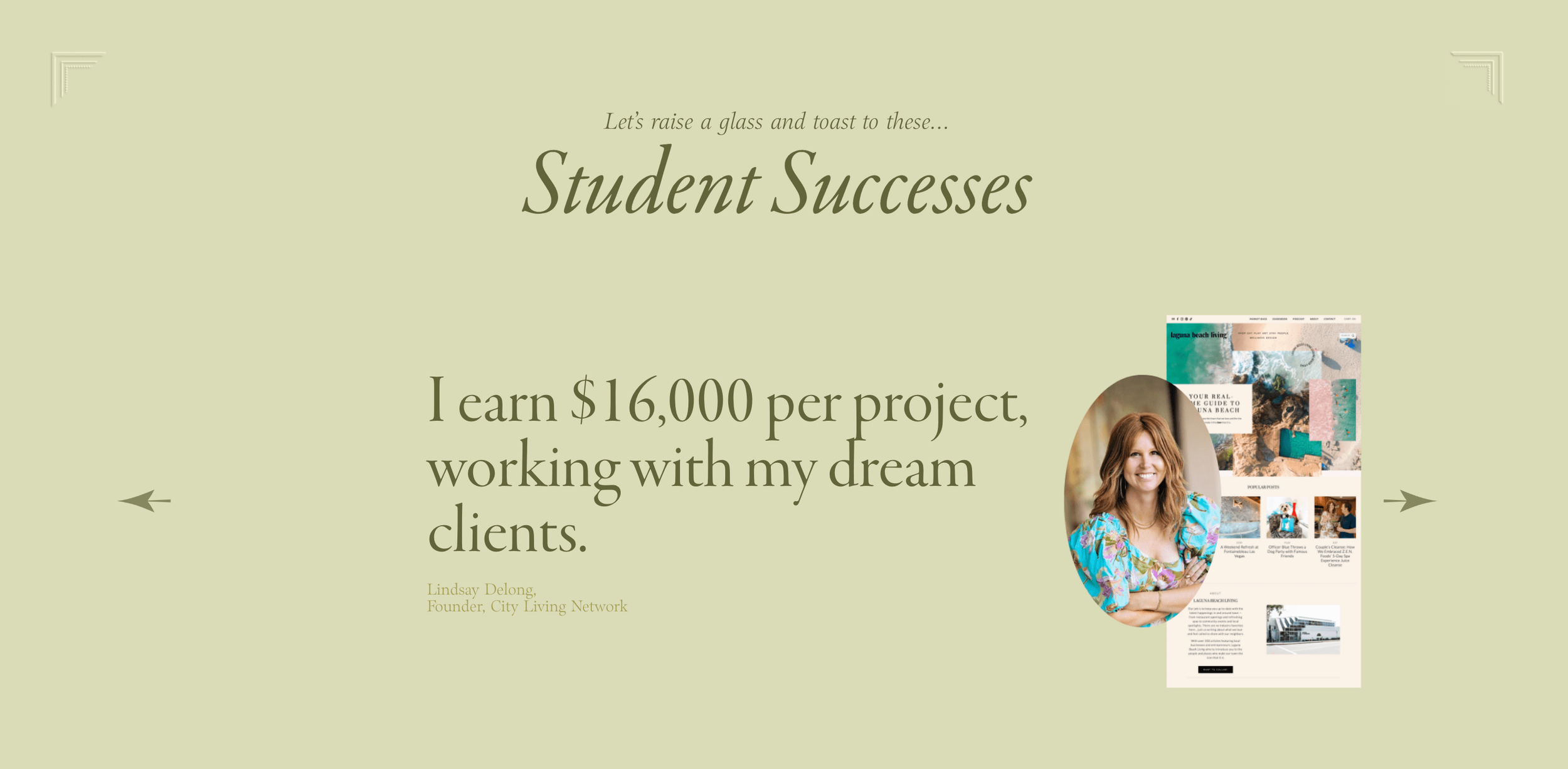
Student Success
Because one of the best credibility builders for my courses are the thousands of students and dozens of in-depth, long-form student success stories showing my courses work.
Courses
Because this is what I actually sell.
This is the page that makes my business money, which is also why it's the most prominent with a button instead of just a text link.
For you this might be a "work with me" or a "services" or a "shop" page. The page that makes your business money, that's the one which you want as a button.
Categorising Other Pages
It’s also important to detrmine what other pages need to exist on this site, or what important things need to be linked to, even if they’re not important enough for the top navigation.
How can these be best categorized into logical categories?
I determined the following categories for my footer navigation.
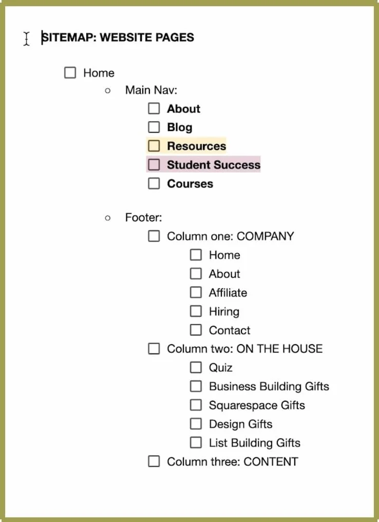
Footer Navigation:
Column One: COMPANY
Home
About
Affiliate
Hiring
Contact
Column Two: WORK WITH ME
Square Secrets
Square Secrets Business
Audience Academy
Student Login
Column Three: CONTENT
Blog
YouTube
Email newsletter
Column Four: ON THE HOUSE
Quiz
Business Building Gifts
Squarespace Gifts
Design Gifts
List Building Gifts
Grouping pages into logical categories makes navigation intuitive for visitors, which improves their overall experience.
How to Plan Your Own Sitemap
When planning your sitemap, ask yourself these two questions:
What are the most important pages my audience will need?
(Prioritize user-friendly navigation)
What unnecessary pages can I eliminate?
(Simplify the structure to avoid confusion and clutter.)
⚠️ A Common Mistakes to Avoid: Unclear Naming for Pages (Your navigation should be easy to understand at a glance.)
Example
Problem: I like to use the words ‘on the house’ or ‘complimentary gifts’ for the free resources I give away because those terms feel on-brand.
However, those terms would make terrible navigation titles because they could be confusing if there’s not extra text to explain those things..
Solution: I used the term ‘Resources’ in the navigation and used ‘On The House’ with a bit of an explainer on the actual page."

Practice Time
Now it’s your turn! Grab a piece of paper or your notes app and follow this 2-step exercise with me.
Take 5 minutes to:
Write down every page you think your website needs—don’t hold back!
Refine—what belongs in your main nav? What can go in the footer?
Decide this based on: Only the most essential pages get the top navigation spot and you have at maximum 6 options.
Items you'd typically find in the top navigation:
About
Work With Me
Portfolio
Blog
Items you'd typically find in the footer:
FAQ
Contact Us
Hiring
Client Portals/Login areas
Step 3: Writing Copy That Converts

Now that we’ve structured the site, it’s time to fill those pages with words.
Why This Step Matters: Most designers will hate me for saying this—but I’m going to tell you the hard truth:
Design doesn’t sell. Words do.
Your copy is the single most important factor in whether your website works or not. Nothing (and I mean nothing), on your site is more important than your copy.
And yes, I say that even though my job is to make things pretty for a living and design beautifully converting sites.
Your copy connecting with your ideal client will literally make or break a website design in terms of said website functioning for your business and selling for you.
Your website’s copy isn’t just filler—it’s what makes visitors stay, connect, and take action. Now that I just seriously heaped the pressure on (sorry about that), let's talk about writing good copy.
Two Common Website Copy Mistakes:
Overload: Most people either overload their site with way too much boring text
Generic: they’re too vanilla, meaning their business blends in with every other similar business out there.
Solutions:
Get your point across as quickly & concisely as possible, while still bringing your brands flaire across.
Arrange it well on the page so it's easily digestible.
To counter the vanilla copy problem, cultivate your "let them" energy, cultivate your most confident, fabulous self as you write this copy. Don't water it down.
Imagine you’re writing for just one person—your absolute dream client. And then, make your copy unapologetically for them. Not for everyone. Just them. If others don’t vibe with it? Let them.
If you don't feel like your copy is very strong or it's not working to convince people to work with you, the solution is to better understand your ideal client avatar.
THE SECRET TO GREAT COPY
I learned copywriting from the fabulous Ashlyn Carter and she taught me something I'll never forget: The best copy comes straight from your ideal clients mouth.
If someone reads your website and sayss "it's like they're in my head" you know you've done it correctly.
How do you manage that?
You get sooo freaking specific in your ideal client avatar exercise.
Again, workbook here if you need help with that!
How I Approach Writing Website Copy:
For my recent website redesign, I broke my copywriting process into three key phases:
Understanding Your Ideal Client
Writing Compelling Messaging
Structuring Copy for Readability & Conversion
1. Understanding Your Ideal Client’s Needs
Before writing a single word, I take a step back and ask:
Who is my audience?
What do they struggle with?
For me and my website design, I teach people how to be website designers. I know that they're dreaming of a fabulous lifestyle-first business which allows them to work from home and pays well, but are afraid if their website building skills are up to scratch to really take on a paid client for example.
PRACTICE:
To help you write your copy, here's an exercise for you.
Write down the top 3 questions or problems your ideal client has.
The top 3 things keeping them up at night. The things they dream of and the things they fear if everything stays the same way in their life.
When you can speak to those fears & dreams, your ideal client is going to read your site and immediately know you get them, and therefore assume, you know the solution to their problem too.
Now that I know exactly who my ideal client is, I can write directly to them. And this is where the magic happens—because great messaging isn’t about listing what you do, it’s about speaking to what they need to hear.
2. Write Compelling Messaging
This requires a bit of training to get it right, or alternatively, training wheels.
Now, I’ve been copywriting educated and I can write great copy myself.
If I want to do it faster & easier, I still pull out one of my friend Ashlyn’s templates.
I specifically used:

✔️ Her About Page Copy Template
✔️ Her Sweet 16 Sales Page Template + Copywriting Workbook
✔️ Her 35 Website Headline Copywriting Templates Collection
They're not mine to share, so I won't show you an example here, but to give you an idea, they're basically Google docs which guide you through what to speak about on every section of your home page for example, with copywriting frameworks & fillable bits to basically help you write copy with training wheels on.
I could write copy without them, but honestly, I don't want to. They save me so much time!
Psst..if you’re looking for a free resource to get the copywriting wheels going, I do have a homepage content planner here!

Key Copywriting Tips:
Pack It with Personality
Remember there's important text on a page you want someone to read, then there's "eyebrow copy," a few words here and there which add charm & character to your main message.
For example the line of copy right above the headline "student successes" is a line saying "Let’s raise a glass and toast to these…" and then student successes. This is eyebrow copy. It communicates my brand voice & vibe in a few short words.
Speak to the conversation happening in their head
They already believe or think something about the product or service you offer. So speak to that.
Make them think you might as well be their therapist.
Speak so specifically to how they feel & what they desire that they literally think "oh my gosh, has she been eavesdropping on my therapy sessions?"
Emotions sell.
Understanding your person sells. So don't just talk about the features of your offer, speak to how they feel and how they will feel after working with you.
3. Structure Your Copy for Readability & Conversion
The Power of Scannable Copy:
Most people don’t read websites word-for-word.
They skim. That means your copy needs to be structured in a way that makes it easy to digest."
Break Up Large Text Blocks – Use short paragraphs & spacing
Use Headlines & Subheadings – Guide the reader’s eye
Bullet Points – Great for quick readability
Call-to-Action (CTA) – Never leave visitors wondering what to do next
Example:
Before & After Copy Formatting
Here’s an example of a section promoting my one of my courses that’s overwhelming vs. redesigned and easy to skim and read.
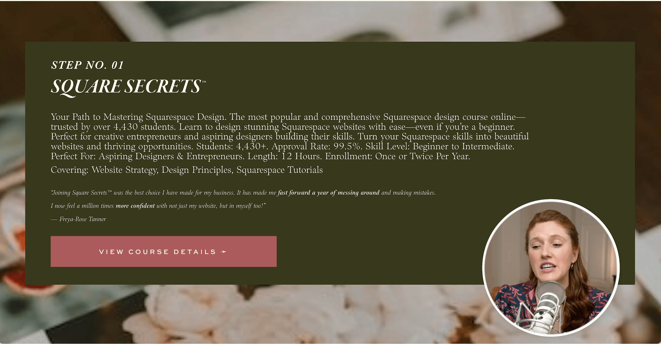
This was one of the most tricky to design sections, and I honestly came up with this layout from scratch to fit my copy because there was just so much to include and it's not your typical copy & layout.
Let’s fix this & turn this cluttered, overwhelming section into a streamlined, high-converting one:

Now that we have powerful copy, we need the right visuals to bring it to life. Let’s move on to Step 4.
Step 4: Choosing the Right Photos for Your Website
Why This Step Matters: Your website’s visuals have the ability to set the entire mood of your brand, without you saying a word. Photos can work for or against you.
Even if your layout and copy are amazing, the wrong photos can make your site feel outdated, disconnected, or amateur.
On the flip side, choosing the right images can instantly elevate your brand, making your site feel high-end, polished, and cohesive.
Common Questions:
Do I need to hire a brand photographer, or can I use stock images?
What makes a photo 'work' for a website?
How do I make my images look cohesive and professional?
Where do I even find high-quality images that fit my brand?
How To Chose Website Photos:
For my website redesign, I used a mix of brand photos I had taken during a photoshoot in Paris and high-quality stock images.
Now I will say, this website redesign was literally a months-long process when you add the photoshoot in.
I started it all with Step 1: Gathering visual inspiration, and then went and planned a photoshoot to help me get images that fit with my visual inspiration. Here’s what was involved:
I went to Paris for a night (catch the vlog here!)
I hired an incredible photographer
I had my husband a.k.a. personal European stylist, consult me on outfits
A few thousand euros later, received these lovely photos.


Stock Images
I also make use of stock photos too, so don't worry if you don't have a large photoshoot budget, stock photos can be incredible.
Whichever option you choose to use, you can still use them incorrectly. So let's start with some photo tips and then I'll show you how to find an image which fits perfectly.
How to Choose the Right Images for Your Website
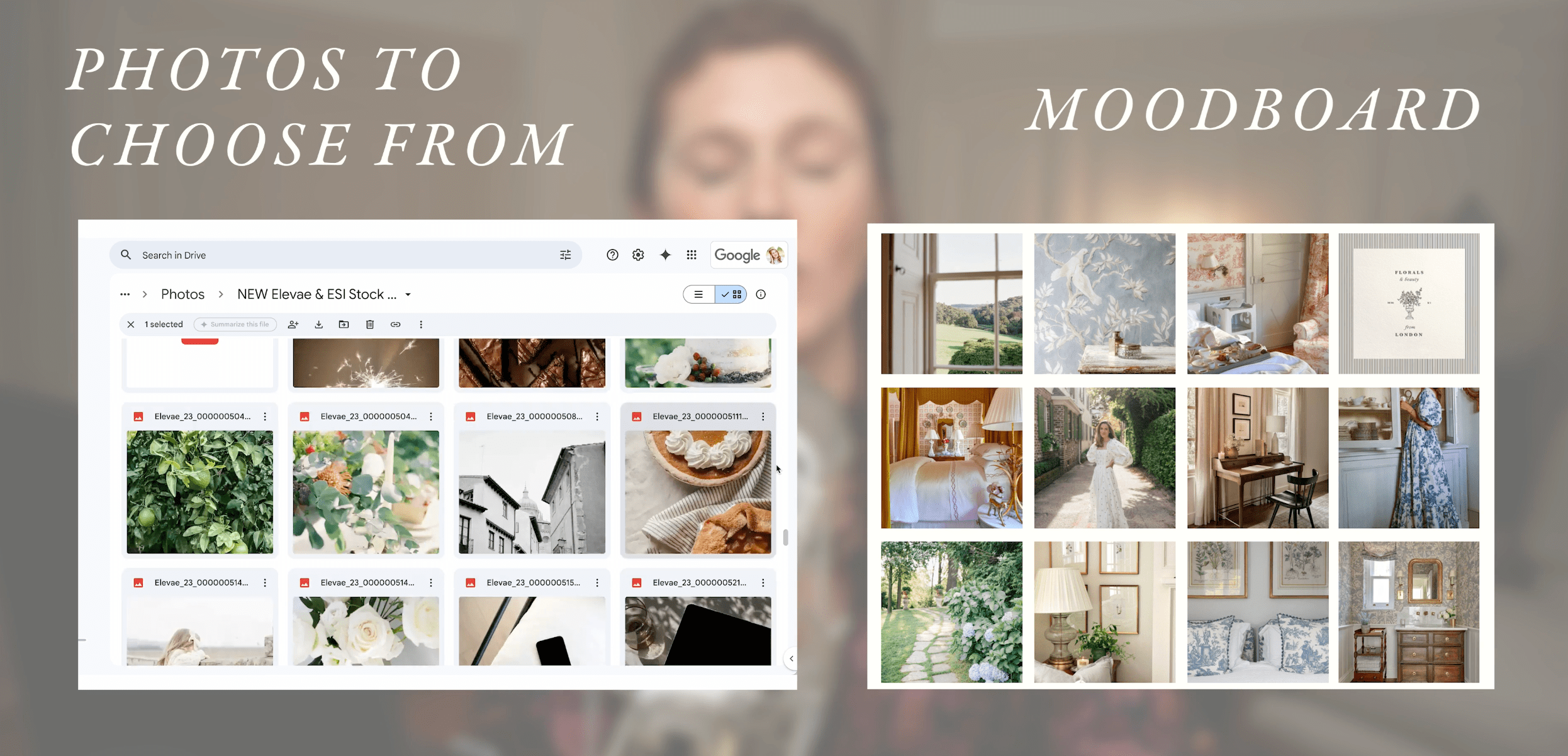
Match Your Brand Aesthetic
Stick to colors, lighting, and a mood that aligns with your brand.
When you're on a stock photo website or even going through the photos you maybe did in a shoot, have your photos you're choosing between on one side of the page and your visual inspiration board on the other.
Always ask the question: "does this photo fit with my inspiration?"
Keep Photos Cohesive
Use similar tones & styles across all images. Similarly light, dark or similar visuals within the images. Here's two photos that are cohesive and two which are not.


3. Make Sure They Feel Authentic
If using stock, pick ones that feel real—not staged. No awkward high fives by people in suits please. Unless cringey & cheesy corporate is the vibe you're going for on your site.
Practice:
Choosing the Right vs. Wrong Images
Let me show you exactly what I mean—watch as I go through different image options and explain what works, what doesn’t, and why.
Attempt #1
Question: do you think that these photos have similar color pallets and create a cohesive brand vibe?

Answer: Not really.
There are a few photos that don’t fit the brand vibe.
The sunset image has colors that clearly don’t fit
The skyscraper image has a very corperate feel that clashes with the vibe.
The team one feels like a classic stock photo.
Attempt #2
Question: what’s wrong with this selection of images?

Answer:
All of the photos are from the exact same photo shoot so they do have similar colors and vibes.
Howver, there are simply way too many pictures of my face aka too much of one thing.
You will also notice the positioning of some of the photos make it hard to read the text.
Note: this is gernerally okay since this text is more of a stylish accent and not key information. However, text that is going over a face is never good as a rule of thumb.
Attempt #3
Question: Does this work? if so, why?
Answer: yes!
I am present in 2 photos- one featuring the face and the other is more subtle because i’m in the mirror- so we’re working with two different angles that aren’t too similar.
The rest of the photos really fit the brand vibe and are a good variety.
The colors match.
My Favourite Free Stock Photo Sites:
My Favourite Paid Stock Photo Sites:
Here are the two sites where I got all of the stock photos for my site redesign.
PS. Those are affiliate links so my margarita fund thanks you if you choose to purchase through them!
Photo Selection Impact (Before & After)
One of my main goals with my website redesign was to mature the site vibe, as well as make it a bit more current in terms of style.
To show you how important images are and them fitting cohesively with your design, let's compare the same site design, just with my old brand photos.

Why this doesn’t work:
Even though there’s a greenish overlay to help it blend with the site’s aesthetic, the stark white, light, and airy vibe still clashes with the overall design.
Also, let’s take a moment to roast myself—sitting on the floor with a laptop and a hand under my leg? The most unrealistic way to work ever!
These photos look a bit dated… because they are.
Speaking of outdated looks, here’s a quick web design trend update: the all-white-everything aesthetic is officially out (unless you’re in the wedding industry).
Curious about more outdated design trends? Check out my video: Outdated Web Design Trends You’re Missing in 2025 (And What Pros Are Doing Instead)
Now that we’ve got the perfect images, it’s time for the best part—bringing the entire design to life!
In the next step, we’ll take everything we’ve planned and actually build a page of my website together. Let’s get started!
Step 5: Live Site Redesign

The page we're going to work on redesigning together is my freebies page. Here’s the old verison. 👇
Now this page is already live, in fact, this entire site has been live throughout my entire redesign process, so I'm using the tips I shared in my video How To Redesign a Live Squarespace site (no down time!)
Step 1 Duplicate:
First thing we need to do is duplicate this page and drag it to the not linked section, so I can redesign it knowing no one will see it, and then when I'm done, I'll delete out the old resources page and replace this new one into the top navigation.
Step 2 Evaluate:
Now let's evaluate what I like and don't like on this page.
Likes:
Clear ordering of items
Copy is good on most freebies but could be improved & lengthened for a bit more enticing of a teaser & to make it quicker clear what this item is.
Dislikes:
Not loving the heading - I think it could go straight into the categories of freebies above the fold along with a quick line in the same section that all these resources are free.
I want each one to be it's own section so they're more defined between each other.
I want more visuals of the items themself and for the visual to communicate the format - training video, PDF, quiz, etc.
I want the main point or takeaway/result of the freebie to be more quickly understandable - like on our courses page (liberal use of bullet points & circled items).
The CTA at the bottom: Could use a redesign too.
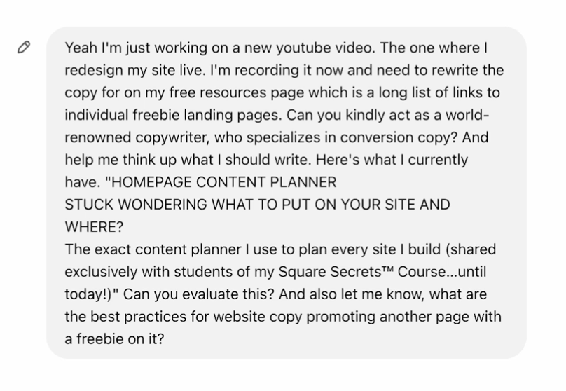
My Chat GPT Prompt…
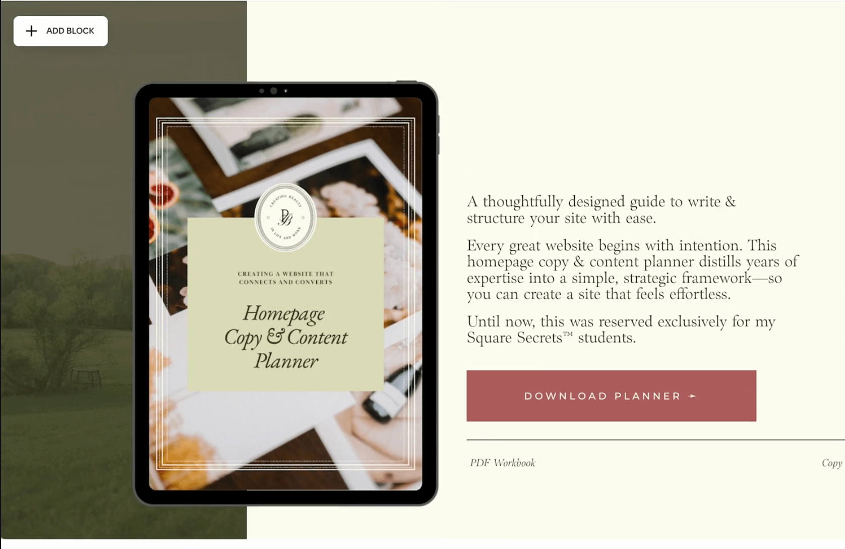
Step 1: Rewriting the Freebie Text
Let’s start by giving one of these freebies a content refresh.
When rewriting copy, sometimes I do it from scratch, but other times I use ChatGPT to speed up the process. It’s been trained to match my brand voice, so I’ll often ask it to act as a world-renowned copywriter specializing in conversion copy and evaluate my existing text. I also make sure to ask it for best practices—for example, what’s the ideal way to promote a freebie on a website?
That said, AI isn’t perfect. The first version it generated didn’t quite feel like “me”. So after tweaking it a bit, I landed on a version I was happy with.
Step 2: Choosing a Fitting Layout
With the copy in place, it’s time to design the section that showcases this freebie. To start, I pulled up my layout inspiration folder to see what styles might fit best.
I came across this clean and structured design:
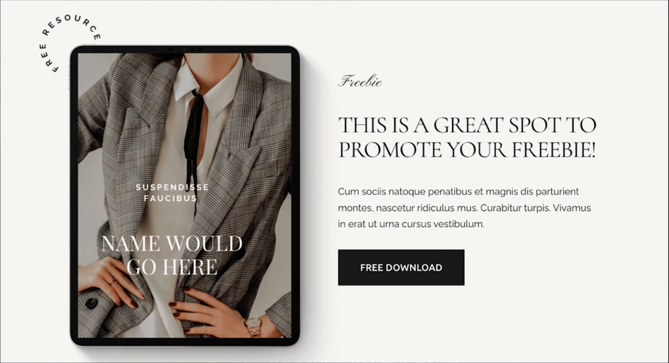
Why I love it:
A large image of the freebie on the left
Key information + a download button on the right
A variety of font styles to make it visually engaging
Step 3: Creating Mockups & Visual Elements
A critical part of making freebies look appealing is showing them in context. Instead of just displaying a plain PDF thumbnail, I wanted it to feel like a tangible product.
To achieve this, I created a realistic iPad mockup in Canva. iPads make sense visually because they immediately suggest a digital workbook or guide, which is exactly what this freebie is.


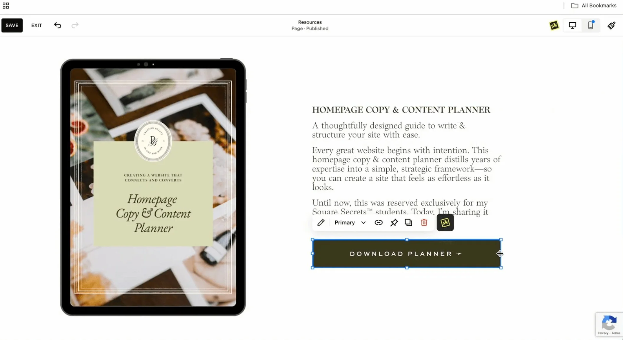
I then started placing elements onto the page:
Text block for the description
Image block for the mockup
Download button for clear actionability
Step 4: Experimenting & Refining the Design
I rarely land on the perfect design right away. Instead, I test multiple layouts by duplicating sections and tweaking different elements.
For example:
Trying a new alignment:
I originally followed the left-image, right-text layout, but then I found an alternative Pinterest design that felt even more modern.
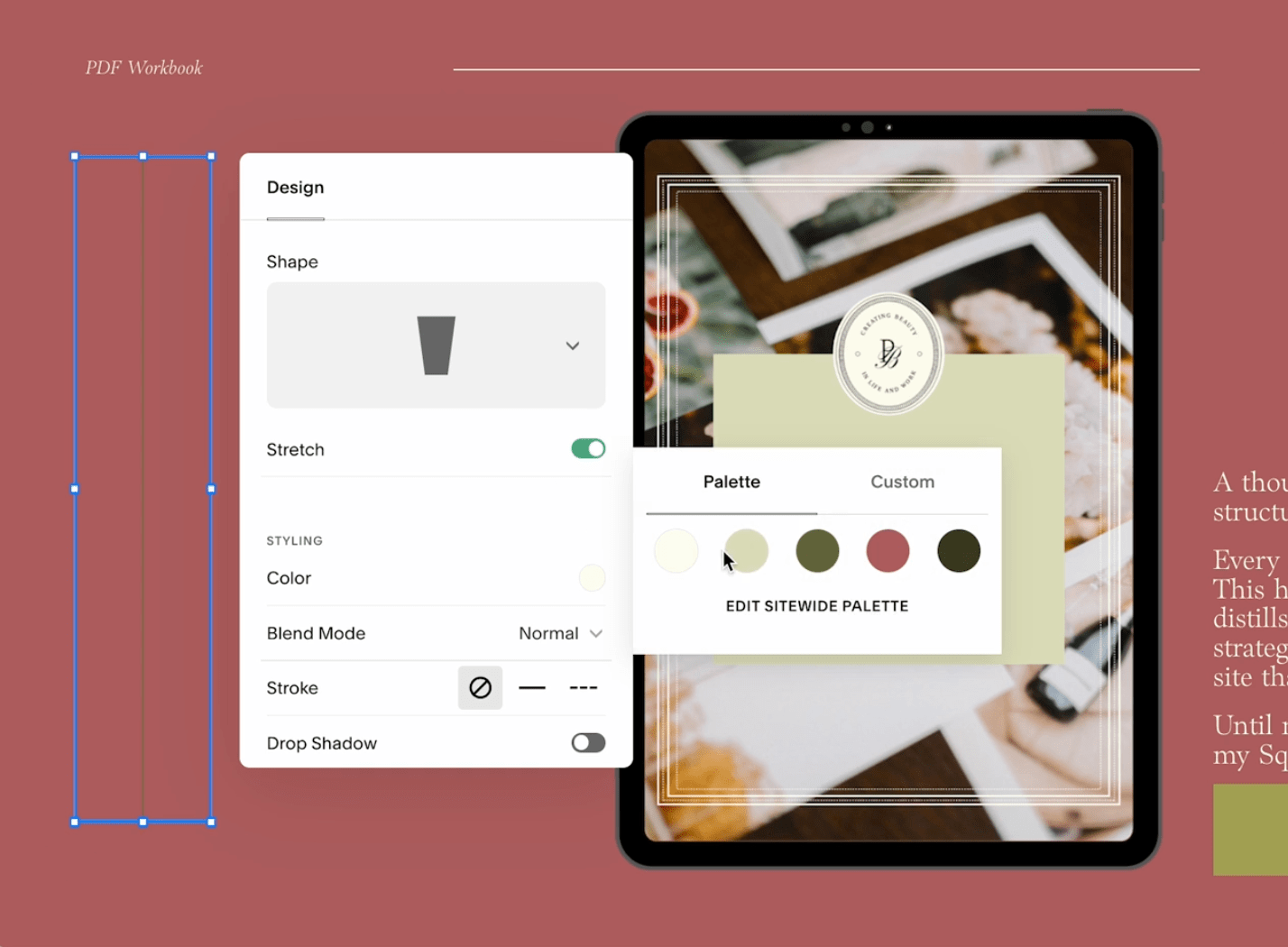
Adding subtle design touches:
I love using SquareKicker to customize my site without writing a line of code—especially for things like turning text sideways or adjusting section layering.
Refining the background:
While I initially wanted a solid background, the page started feeling too bare. I experimented with soft, subtle background images that wouldn’t distract from the main content.
After testing a few versions, I landed on a design that feels balanced, clean, and visually engaging.
Creating a Second Freebie Section
Now that I have a solid structure, I can easily duplicate it and adjust the design for the second freebie: the Canva & Squarespace Fonts Guide.
Since this freebie is about fonts, I didn’t want a photo-heavy design. I opted for a simple, stylish background—in this case, lemons. (Yes, random, but it gives a chic European aesthetic that fits my brand!)
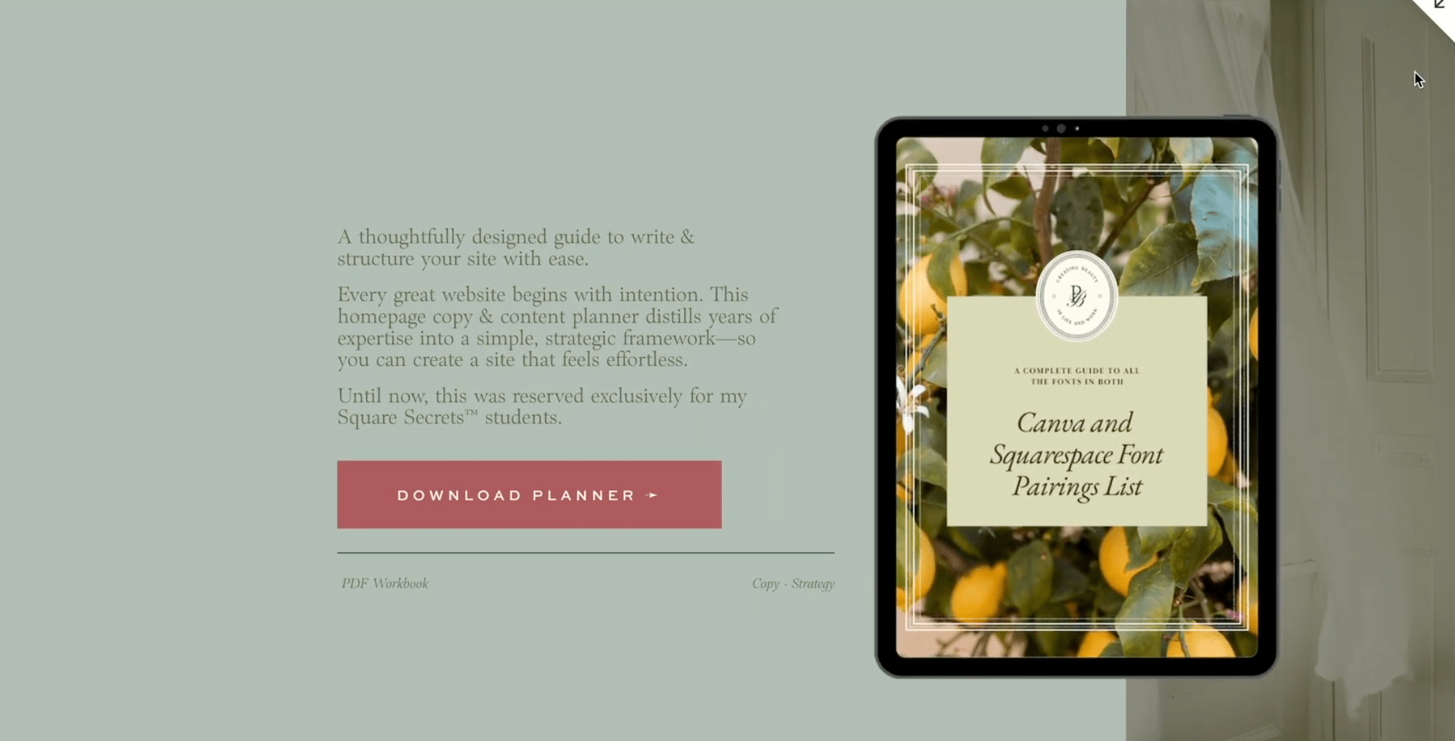
To keep things interesting and prevent the page from feeling repetitive, I flipped the layout so the second section has the image on the right and text on the left.
This is one of my go-to strategies: keeping a consistent structure while adding enough variation to keep the page engaging.
Final Touches & Optimizing the Page
Now that both freebies are designed, it’s time to finalize the page flow. A few last refinements:
Adjusting button colors to make the call-to-action pop
Fine-tuning font sizes for visual hierarchy
Adding divider lines between sections to make transitions feel more intentional
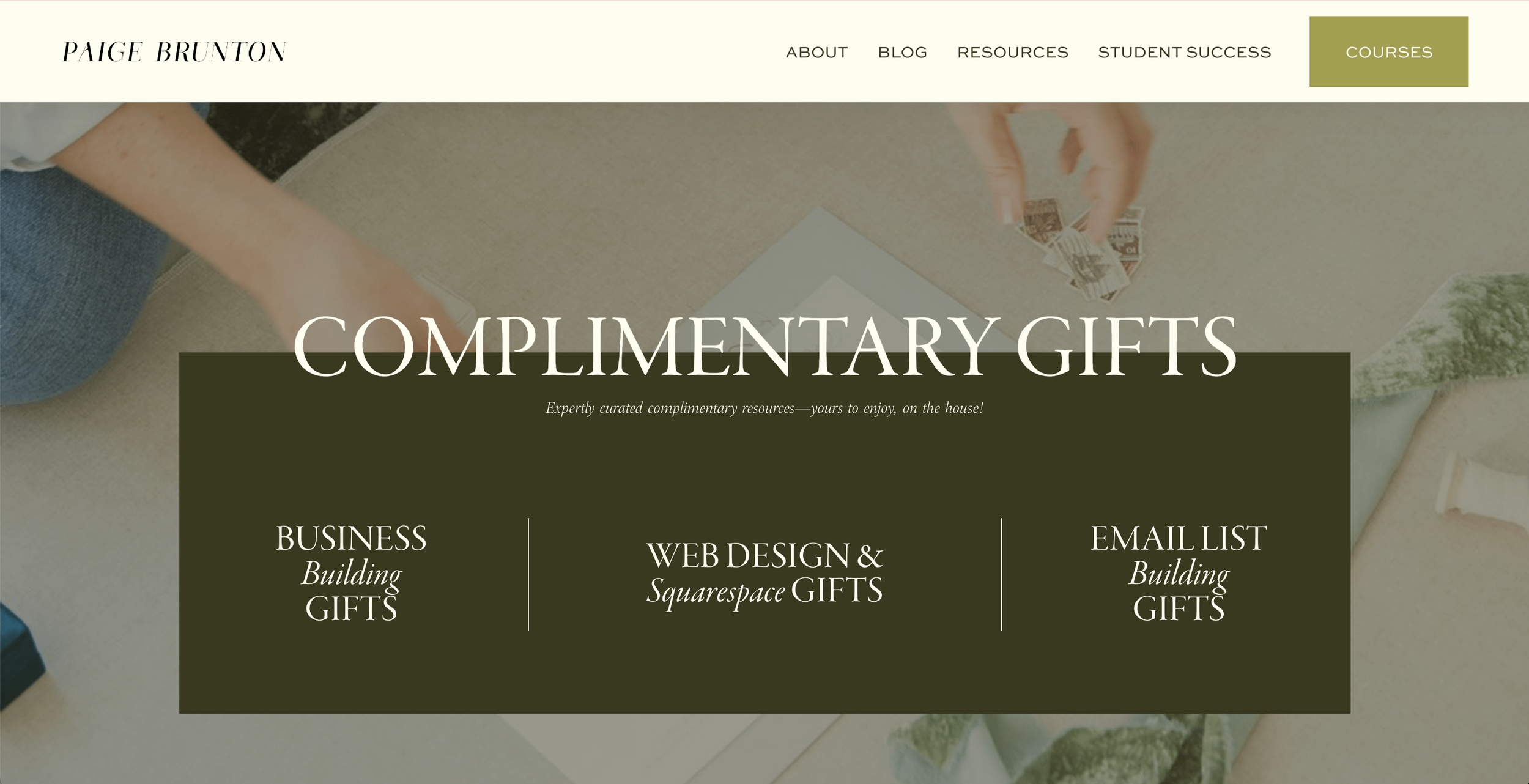
The Header Section
Now, I also needed to set up a strong header section that introduced the entire freebies page.
Looking at my inspiration folder, I loved the idea of incorporating vertical lines & stacked text like in this design…

…and a mixture of font styles to make it visually dynamic.
I tested a few different header options, playing with contrast and layering elements until I found the right balance…

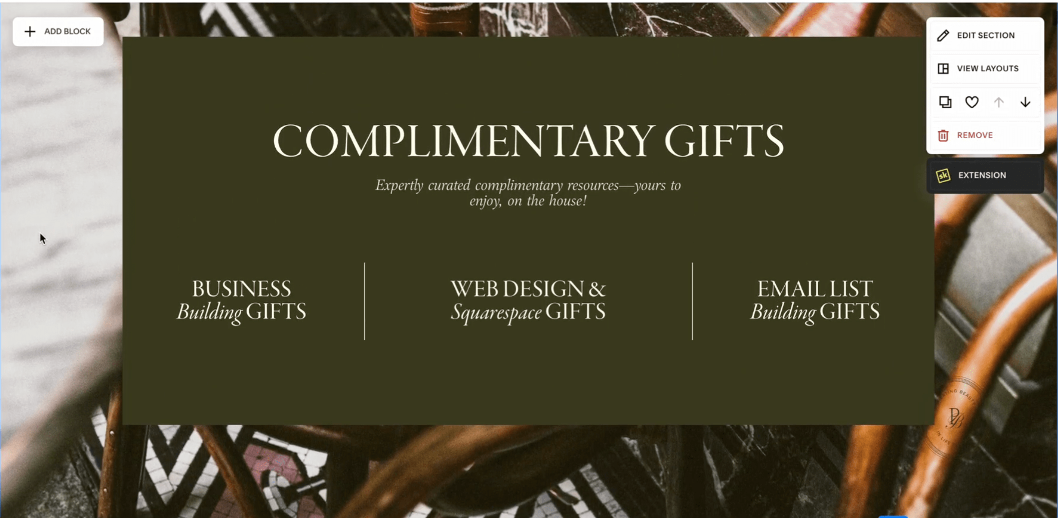
The final version feels polished, readable, and in line with the rest of the page:
Bringing the Full Page to Life
With everything in place, I took a step back to review the full page flow. The final design now:
1. Feels cohesive and visually balanced
2. Highlights each freebie without overwhelming the viewer
3. Maintains consistent branding across images, fonts, and layouts
And there you have it—a complete transformation! We started with a basic structure and completely redesigned it into a high-converting, beautiful freebies page.
Next Steps: Want to Design Like This for Clients?
Now if you could imagine doing redesigns for not just yourself, but for paid clients too as a proper designer, I realize figuring out the entire web design client process can be confusing.
So here’s a little gift to make things easier for you!

While all the things we spoke about here are important, I realize there's one vital bit we skipped over.
Picking the right colors can be so overwhelming. Turns out, there's an exact formula & rule to picking the right ones. It's called the 60-30-10 color rule, and I explain it fully for you in this video. Be sure to watch it next!